Infografik der Woche
Diese Woche zur Ausbreitung des Coronavirus
12 Bilder. Für eine vergößerte Darstellung bitte anklicken.
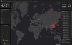

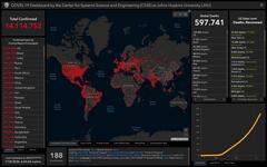
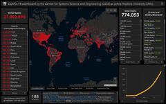

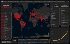

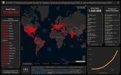
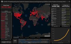
Am Center for System Science and Engineering (CSSE) der John Hopkins University entstand dieses Projekt zur Dokumentation und Visualisierung der Verbreitung des Coronavirus. Seit dem ersten Auftreten (31.12.2019) bis heute sind erst 36 Tage vergangen, also kann man sicher noch von einer sehr frühen Phase sprechen. Die Übersicht listet im Moment knapp 4.500 Fälle und zeigt den sprunghaften Anstieg seit 24. Januar. Hoffen wir, dass die drastischen Maßnahmen in China eine weitere und vor allem weltweite Ausbreitung verhindern. Hintergrundinformationen zum Projekt im Blog des CSSE.
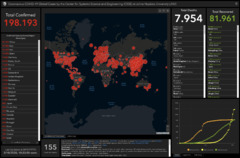
Update 18.03.2020: Was acht Wochen für einen Unterschied machen; neues Bildschirmfoto des Dashboards.
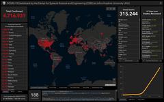
Update 18.04.2020: Ohne Worte.
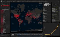
Update 18.05.2020: Verdopplung der Zahlen weltweit gegenüber letztem Monat.
Update 18.06.2020: nicht mehr ganz Verdopplung weltweit zu letztem Monat
Passender Artikel zum weiterlesen: Infografik der Woche vom 11. März 2020.
comment Kommentare
Martin am 11.03.2020, 20:25:
Martin am 11.03.2020, 20:38:
Martin am 16.03.2020, 10:49:
Martin am 18.03.2020, 11:01:
Martin am 21.03.2020, 16:40:
Birgit am 30.03.2020, 13:20:
Birgit am 30.03.2020, 13:24:
Neuer Kommentar
Bitte beachten Sie vor Nutzung des Formulars die Datenschutzerklärung.